Thursday, December 22, 2011

Release 0.15

Killer Arguments
Sometimes one argument can kill the whole option. A price of $101 for example might force you to exclude a product from consideration completely, when your budget is strictly limited to $100. Still in the other factors the option might be the winner (likely for an expensive product).

Like it would have been deleted, a killed option is excluded from scoring, only representing it's existence for documentation purposes. Later the "killer" argument might change and the option is included in the scoring again.

Import Bookmarklet
A Bookmarklet is a special "Bookmark" on your browser, allowing you to work with the information you see on a currently open Web page.
The Choosle Bookmarklet allows you to transform a HTML table into a new Choosle.
Drag the Bookmarklet link from the Import dialog (manage - Import) into your bookmarks toolbar, browse to the Web page with the HTML table to import and click on the Bookmarklet. Then click on any table cell containing the title of an option. Next click on another table cell with the title of another option (=> selects the row or column with the options). Last click on a table cell containing the title of a factor (=> selects the column or row with the factors).
On Wikipedia the options are often listed in the first column
 and the factors in the first row.
A click on the Import button creates a new Choosle with the selected options, factors and fills in the arguments from the HTML table contents.

5-Star Input Controls
Instead of having to switch between the 5-star and the +/- slider rating modes, the +/- slider ratings now show a 5-star control on mouse-hover, allowing you to quickly input a rough rating value with one click.
The slider position automatically moves with your star selection.

Saturday, November 19, 2011

Release 0.14

This release shows itself mostly on the front page.
The 5 most popular (mostly viewed) Choosles are listed above the featured Choosles.
And right beside you can play a video to get a short overview of some basic features of Choosle.

Several other, smaller changes are included in this release, but not directly visible to the user.

Saturday, October 29, 2011

Release 0.13

More than 5 Options
Even though we thought of Choosle focusing on the last ~3 options to have a chance of winning, you have quickly collected more "potential" options. Even if it's only to remember, they are there and have no actual say in the decision.
You could add more than 5 options to a Choosle in older releases, but scrolling horizontally to finally discover them all... there must be a better way.
A list at the side of the comparison matrix now shows you all the options compared. The list items correspond directly with the columns of the matrix.
To keep the comparison matrix small only the 3 highest-ranked options are visible by default.
With a simple click on a title in the option list you can show or hide the according option columns in the matrix.


While the option list allows you to handle up to about 20 options (depending on your screen size), you will see an additional scrollbar, if the number of options becomes even higher (not recommended).


Score Icon
Instead of the score value (weighted sum of all attribute ratings) being displayed in the top-right corner of the option title box, a small icon now shows this value relative to the others.
Since the winner option is marked already, it's score icon in the option title box is omitted.
The icon is also shown in the option list.

Friday, October 14, 2011

Drink Mineral Water!

Drinking plenty is healthy. Some bottled waters provide natural minerals valuable for the body.

Even though tap water is often "healthy" enough... the water from my tap could taste better.

Wednesday, October 5, 2011

Release 0.12

Visible Private State
A Choosle not visible to the public (no public link) now shows a "private" label below it's description.
When you allow the public to visit your Choosle, the "private" label will be replaced with a Facebook Like button.
Each visitor, who "likes" your Choosle, helps to make it more popular.

User Label
There are several places within the Choosle application where your name or Email address has shown up. In overview lists, the Choosle header, in greetings and comments,... you might be shown as author or editor.
"Bruno Feurer" will be displayed only.
You can now define the user account name that will be shown throughout the application. This way you can make sure your Email address does not get published.

The default user label is generated via your first name, space, last name or, when non of them are available by the user name of your Email address (name before '@').

Crawler Friendly
Search engine crawlers, bots will be served by a static snapshot of your public Choosle. So people can "google" the text content of your Choosle.

Private Choosles (no active public link) will not be accessible by crawlers.

When you want to hide your public Choosle by deactivating it's public link, it might take some time before it will not show up in the search results anymore. Crawler don't visit a site very often and so you might find a link to an older snapshot in the result listings. When the user tries to use that link to access your now-private Choosle a no-access error message will be served. 

Wednesday, September 7, 2011

Beta Release 0.11

Direct Text Edit
The new implementation of the text edit controls in a Choosle view allows you to edit the visible text more directly.

With the first click on the text you can place the input cursor at the position of the click and start typing.

Active Links
Type or copy&paste a link URL (http[s]://...) into your text. It will automatically be transformed into a clickable hyperlink or into an image (see next chapter).


The generated default label text for the link contains only the domain name from the URL. It can be changed by editing the link text or changing the label (and URL) in a special dialog.

Images Links
Image URLs, ending with ".png", ".jpg", ".gif" or ".bmp", will be transformed and shown as images.


You can align the image left, right, centered or in-line with the text.

Saturday, August 13, 2011

2nd Public Beta Release 0.10

Right-Click Context Menu
The context menu now opens on right-click by default. Since lot's of users don't expect a context menu in a Web application, you can now select an element and it's menus will be included in the "edit - ..." page menu.


To open the default browser context menu you can always use <Shift>-right-click. In your Settings you can also switch off the context menu completely or switch back to the left-click.

Direct Drag&Drop Move
In addition to dragging the slider right-border to directly rate an argument (or weight a factor), you can now grab an argument anywhere else and drag to move it's row and column around.


Of course this works for factors and options too.

Show Author Directly
Even though a Choosle could serve as an all-time reference, most Choosles represent a certain point of view on a certain topic in a certain period of time. To support that situation, the title of a Choosle now also shows the author and the date of creation. On-hover also shows the date of the last change.

Not Directly Visible Changes

Monday, August 8, 2011

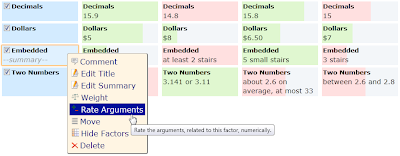
Rating Numbers

The arguments of factors like "Price", "Length", "Size",... usually contain numbers, directly related to their rating. 

While you can simply move the rating sliders to approximately match these numbers (a rough mach does mostly suffice), a special menu of the factor lets you rate such arguments more easily.


The argument texts are scanned in order to determine representing numbers and the rating values -100..+100 are assigned accordingly.


When necessary, you can correct the automatically determined number values and define the range for the rating values. As for this example we want to inverse the ratings, since less stairs are better. Then apply these rating values to the arguments and let the rating boxes (or the 5-stars) show them accordingly.

Sunday, August 7, 2011

Share your Choosle (Update)

Simpler Sharing Dialog
In response to the feedback for the original, fine grained approach to access control and sharing (see Share your Choosle), the sharing dialog has been simplified.


You can only share your Choosle via one of it's links. There are 3 possible links to access a Choosle. A "public", an "edit" and an "admin" link. The public link opens the Choosle for the public to read and to comment. The edit link allows the user to modify the content, ratings, weights,..., but not sharing or deleting the Choosle itself. And the admin link allows full access to all the functions, including sharing itself.

All theses links can be enabled/disabled at anytime. In order to do that you need to open the Choosle via it's admin link and open the sharing dialog via the "manage - Share" menu:


Anonymous Choosles
For anonymous Choosles (no user login) all these links are created and enabled by default. Via the sharing dialog the admin user can disable the public and edit link to declare it private (only accessible via the admin link).

Personal Choosles
When the user has logged in, before creating a Choosle, he will become the author of that Choosle and only he is allowed to access it by default. As the author he automatically has admin access and can enable/disable all the links in the sharing dialog.


Link Security
While the public link might be reconstructed pretty easily (simply the encoded Choosle identifier), the other links contain a random token, making them very difficult to guess. You should make sure to send theses links only to the people you trust!

Other Sharing Options
Please let us know, if you need other options to share your Choosle.

Saturday, July 30, 2011

Choosle Web Development

Like in many workflows in the process of Web application development many decisions have to be made.

While developing this Web application, Choosle itself has become handy here and there.

Choose a New Car

Some people care about more than the color, when choosing a new car.

Compare the things that really matter to you in a Choosle.

Monday, June 20, 2011

Share your Choosle

With the Choosle prototype 0.6 you are able to share your Choosle with other people in a more controlled way. You can still open it to the public or keep it private. When you open it to the public for example, you can now specify, what "the public" can do with your content. Do you allow any visitor to make changes, to have full access or only to comment your content (default).

Instead of sharing it with everybody, you can share it with some specific people only. There are two ways to do that.

Share via URL
The Web site can generate special URLs to access a Choosle with certain features allowed. Such a link includes a 16 random-character token, so it should be really difficult to guess. For example the following link...
...provides read-only access to "Choose Choolse". The ".read" suffix is optional and only informational.

Simply send the generated URL for your Choosle to every friend and college, you want to share it with. When such a URL becomes publicly available, by accident or maliciously, you can remove it from your sharing list (this cannot be undone!), generate a new one and send that new one to the correct recipients.

You can allow public access via a special form of such a URL. You specify the access level and add a public URL without the random token or any suffix. For the example above the URL...
...allows anyone to read and comment (then the special read-only link does not make much sense of course ;) . A Choosle with a public URL is also included in the "public" search results.

By default the Web site generates an administrator URL (full access), an editor URL (allows to modify content) and a public URL (allows to read and comment) for a new Choosle.

Share with Registered Users
When you are logged in and the person, you want to share your Choosle with, is also a registered user, you can grant specific access to him/her explicitly. This user has to log in, in order to access the Choosle.

When you create a new Choosle while you are logged in, you will automatically be provided with full access. No sharing URLs will be created.

All the Choosles, the user has access to, will be included in "personal" search results.

Monday, May 9, 2011

Negative Ratings

All Positive
We want to be positive all the time, don't we? And we "like" everything! So there is no need for a "dislike" button on Facebook... Facebook Dislike Button: Why it Will Never Happen

Well, for Facebook you can privately collect your dislikes with a Firefox add-on or post some "negative" comments to express yourself. But you shouldn't! You are supposed to promote good karma in a social network and Facebook wants to generate revenue with positive company pages.

Unlike in social communities, in the context of a Choosle you should consider negative arguments. A decision base on only the good factors can hardly be sound and objective. The "bad" arguments also carry information. They, at least, reveal, that you have not ignored or simply forgotten them. Some option might have negative consequences, even if it wins with many pro-arguments. For example a high price for a product might be a bad argument, but you still need to be aware of it, when making your decision. Probably that high-price option has a lot of advantages and will win over the others otherwise.

Reputation
While in open communities negative ratings or down voting could become personal and might likely to be misused, the ratings in a Choosle should have a very small, if any, connection to the author of the argument. It's not about any reputation of the participants (well, it never is ;), it's about comparing the options with each other. Also, Choosles will most likely to be shared within smaller, closed groups. Public Choosles are mostly read-only, providing for example/template copies and suggestions. There should be no need for a prove of seriousness or a system to discourage negative ratings (The Value of Downvoting, or, How Hacker News Gets It Wrong).

Go/No-Go
In a all-positive world, go/no-go decisions would also be difficult to interpret with all the pros and cons for the one option rated more or less positive. You have to decide on the score being above or below a certain medium value. Also the visual impression would be wrong, if the cons appear positive (maybe less positive, but still positive).

Representing Negative Ratings
Technically, it is only a definition of the rating value range. 0..20 is as good as -10..10. We simply define 10 for neutral in the first range and 0 in the latter. Or with a 5-star rating element, only empty stars must be bad, 5 full stars are good and 2.5 stars mark the neutral rating. Visually it probably shows more something like empty stars for "no opinion" to full stars for "I like it very much".
Interpreting the range values is cumbersome. You need to think about it with every rating of every argument. So if we want to rate negatively, the number values should also represent that intention directly.

When to rate negatively?
Most often you have some kind of natural bias within a topic of interest. Maybe it's a budget you have in mind, some expectations about how something should be or an average of experiences. This bias marks the neutral value 0, no visible slider bar or 2.5 stars.

In a shared decision you might also want to signal your disapproval of the average rating from others by compensating their values with a negative one.

First Implementation in Choosle
In Choosle we already have +/- sliders to color the text of an argument in green for positive and red for negative. The planned 5 star rating control (see the previous post) could be presented with green stars for positive and red stars for negative (maybe via right-click).

Saturday, May 7, 2011

Rating

We rate or judge all kind of things. Products, services, thoughts, statements, accomplishments or even people. "She is a perfect 10!", "You have got an A+!", "I like this idea best.", "That is the best deal you have ever made!",... .

Rating helps us to compare things within a certain context. Sometimes we define this context ourselves ("she is a 10", so she is the best looking girl I can think of) or it is given by the situation or the environment.

To give a rating a comparable meaning, a range of values must be defined. Mostly this range is connected with the context and again we can (re)define it ourselves (wow, i have just met a 12!) or it is given by the environment.

With some ratings we also need some reference rules for the range values. Most schools in Switzerland for example define a grad 6 as the best, a grad 1 the worst and a 4 as passed. In Germany it is the other way round, a 1 is best, a 5 worst and also a 4 has passed. Other countries bring in letters A..F and +/-... I hope you get the point.

Visually we express rating values in all kind of forms:

CO2 emissions of a car

Hotel classification

Some rating user interface controls I have found on the Web:

In Choosle you will find simple 5-star controls for a quick roughly rating and a green/red slider for a more fine grained input. In the backend data model both controls produce values in the range of -100..100. So they can be switched at any time.

Monday, April 4, 2011

Initial Idea

Some time ago, I've explained some features of a project, I was working on, to several people. Unfortunately these people approached me one-by-one, having me to tell my story all over again. So why not starting a blog about different aspects of the project? A compact form of the content is easier to understand and could be shared easily with everyone interested. Good idea, but which blogging solution suits best? I've started some research, finding myself once again collecting the pros and cons with a simple note-taking tool on my iPhone. Soon the text note grew bigger and to compare the notes for the different options became a research itself. Without an overview and a quick way to see the resulting ranking after changing a rating, it became difficult to find the important criteria, having a real affect on the decision.

In the end the decision for choosing a blogging solution has taken longer than the work I was planning to blog about. So that decision itself was left open and postponed by the environment.

I could also remember having started a similar decision some years ago. Yes, the tools hopefully have evolved over that time and new options are available, but at least I would have had a starting set of factors to research and rate the options on. Of course I couldn't find the Excel sheet with my earlier notes.

With similar experiences in mind I was looking for a simple tool to comfortably collect and rate my options and arguments and to manage my closed or postponed decisions. Availability is also a factor, so a nice, simple Web 2.0 application should do the trick nowadays. And in some decisions my team-mates, my friends or my girlfriend (sometimes ;) also have a say. So a simple sharing feature would be welcomed.... I couldn't find any!

Imaging, that I'm not the only one, who could benefit from such a tool, I've started to build the idea, Choosle is based on. In the mean time several additional use cases have risen to the surface and people from different areas, from insurance agencies (which package fits best?) over human resources (who fits best for the job) to travel agencies (where to travel next?), can see use cases in their work. More personal, private decisions (new job, new car, best school for the kids, new house,...) and of course any form of product evaluations can also benefit from Choosle.

And of course the sharing aspect could also attract some users. Community decisions ("We have several new locations for our new club house, where should we move to?", "This candidate is probably best qualified for the job, but who would be chosen by the team?"), consulting (have an expert to look over your arguments and ratings) and starting examples (generalized decisions from others, concrete ones from friends) are not served well yet.

So the vision for Choosle is: Helping people to make better decisions and to explain them to others.